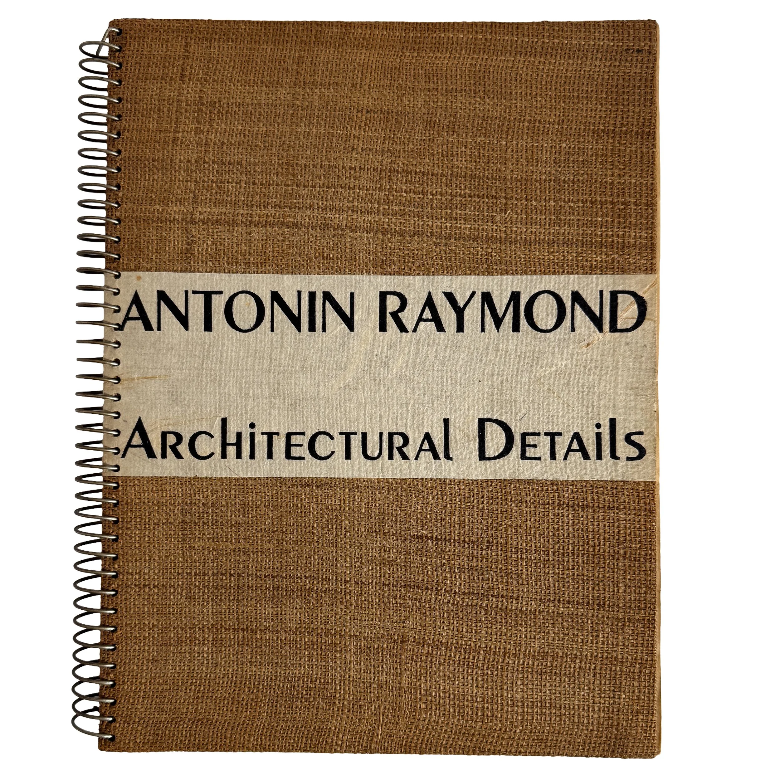
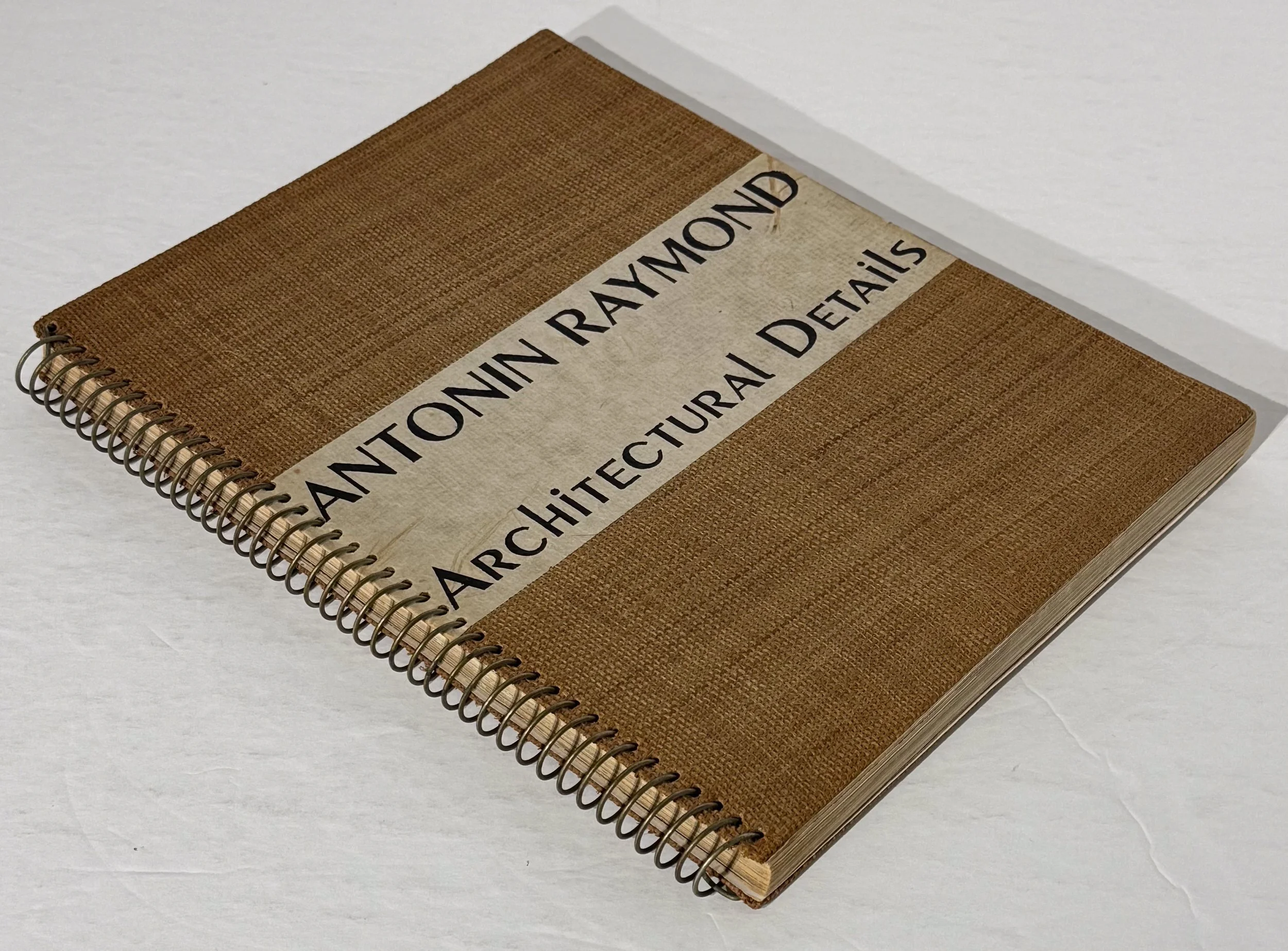
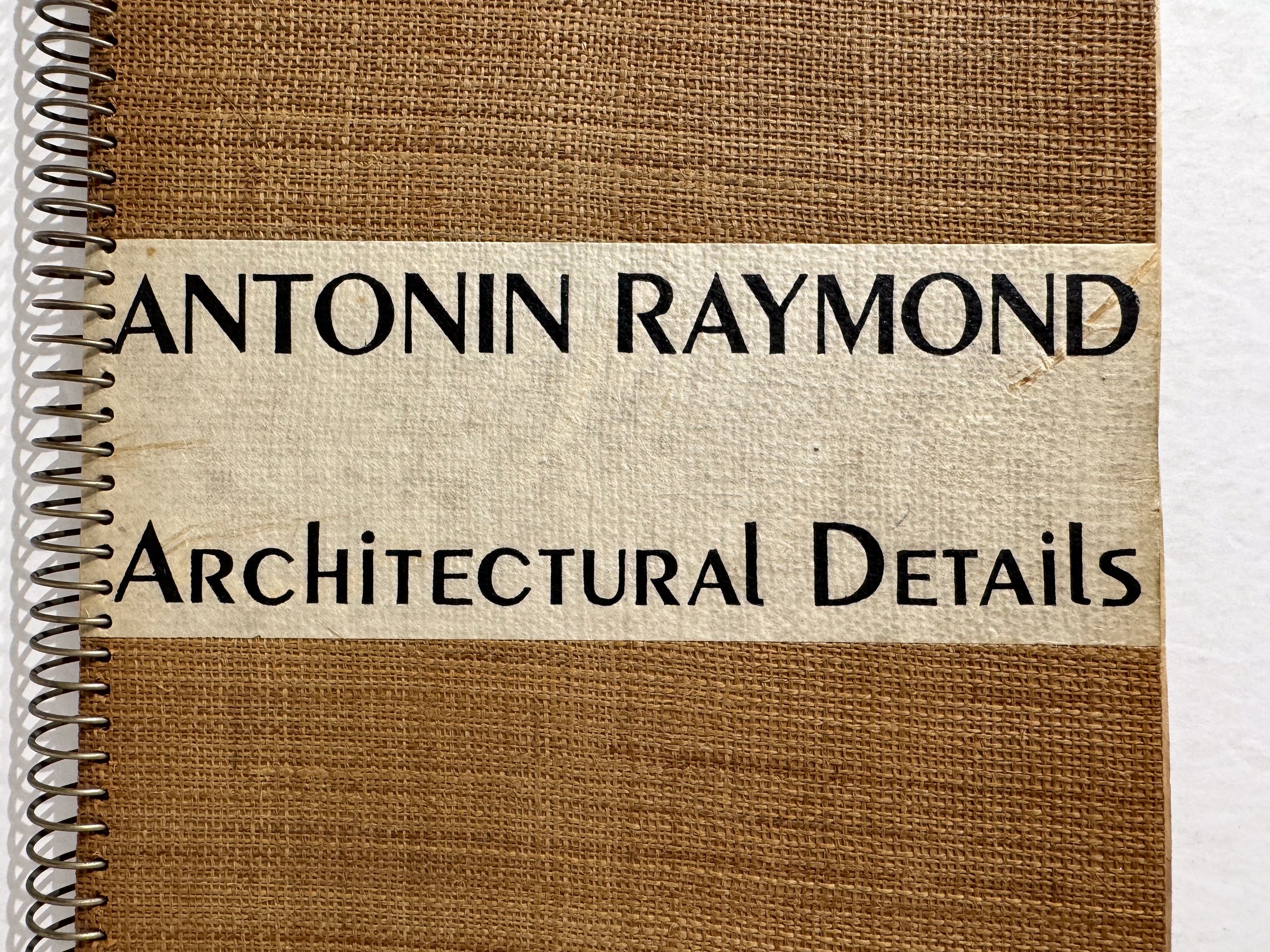
First edition of this guide to the 1939 (and 1940) New York World’s Fair, published jointly by P/M Magazine and the Laboratory School of Industrial Design. 8vo (5.75” x 8”), printed wrappers, 36 pages, b/w illustrations. Composition, typography, and layout by Paul Rand; foreword by MoMA curator of Architecture and Industrial Art John McAndrew. The scarce standalone issue, with the original 50-cent price inside the front wrapper—not the more frequently encountered version bound into the August–September 1939 issue of P/M.
Published when Rand was twenty-five, with one of the defining covers of early American modernist graphic design. Its elementary geometry draws upon Bauhaus and New Typographic antecedents, but transforms them into a specifically American language of symbolic compression. The Fair’s architectural emblems become a visual equation: an elongated triangle evoking the Trylon, a plus sign, and a circle representing the Perisphere—Trylon + Perisphere.
Compiled by students and faculty of the pioneering Laboratory School of Industrial Design, the booklet provides a selective critical survey of the Fair. John McAndrew, then curator of architecture and industrial design at the Museum of Modern Art, establishes a functional-modernist standard by which the Fair’s architecture, interiors, exhibitions, lighting, furniture, and commercial displays are assessed. Among the designers and architects considered are Donald Deskey, George Howe, Walter Dorwin Teague, Norman Bel Geddes, and Alvar and Aino Aalto.
Moderate bumping and rubbing to extremities, with creasing to spine and fore edge of front wrapper. Rare in the standalone state.
First edition of this guide to the 1939 (and 1940) New York World’s Fair, published jointly by P/M Magazine and the Laboratory School of Industrial Design. 8vo (5.75” x 8”), printed wrappers, 36 pages, b/w illustrations. Composition, typography, and layout by Paul Rand; foreword by MoMA curator of Architecture and Industrial Art John McAndrew. The scarce standalone issue, with the original 50-cent price inside the front wrapper—not the more frequently encountered version bound into the August–September 1939 issue of P/M.
Published when Rand was twenty-five, with one of the defining covers of early American modernist graphic design. Its elementary geometry draws upon Bauhaus and New Typographic antecedents, but transforms them into a specifically American language of symbolic compression. The Fair’s architectural emblems become a visual equation: an elongated triangle evoking the Trylon, a plus sign, and a circle representing the Perisphere—Trylon + Perisphere.
Compiled by students and faculty of the pioneering Laboratory School of Industrial Design, the booklet provides a selective critical survey of the Fair. John McAndrew, then curator of architecture and industrial design at the Museum of Modern Art, establishes a functional-modernist standard by which the Fair’s architecture, interiors, exhibitions, lighting, furniture, and commercial displays are assessed. Among the designers and architects considered are Donald Deskey, George Howe, Walter Dorwin Teague, Norman Bel Geddes, and Alvar and Aino Aalto.
Moderate bumping and rubbing to extremities, with creasing to spine and fore edge of front wrapper. Rare in the standalone state.

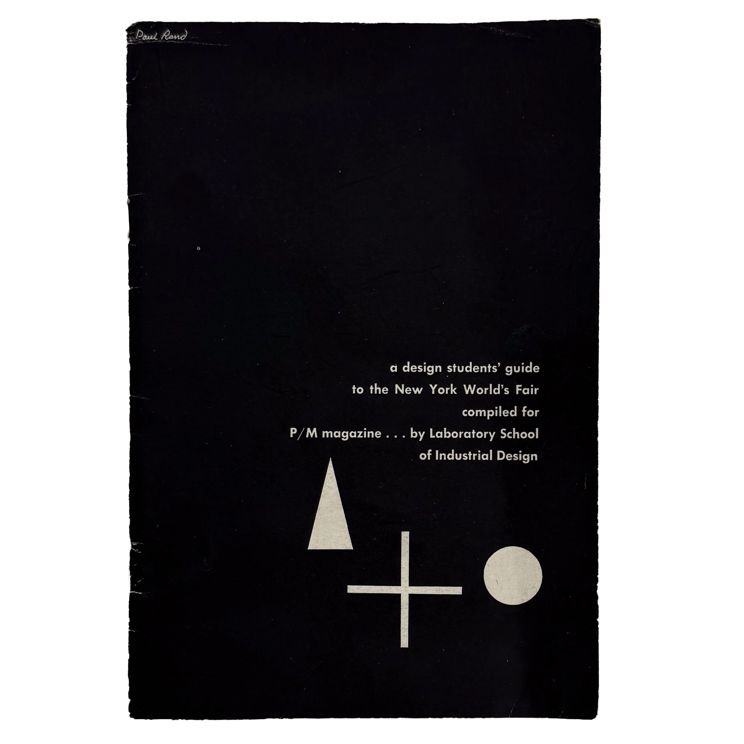 Image 1 of 13
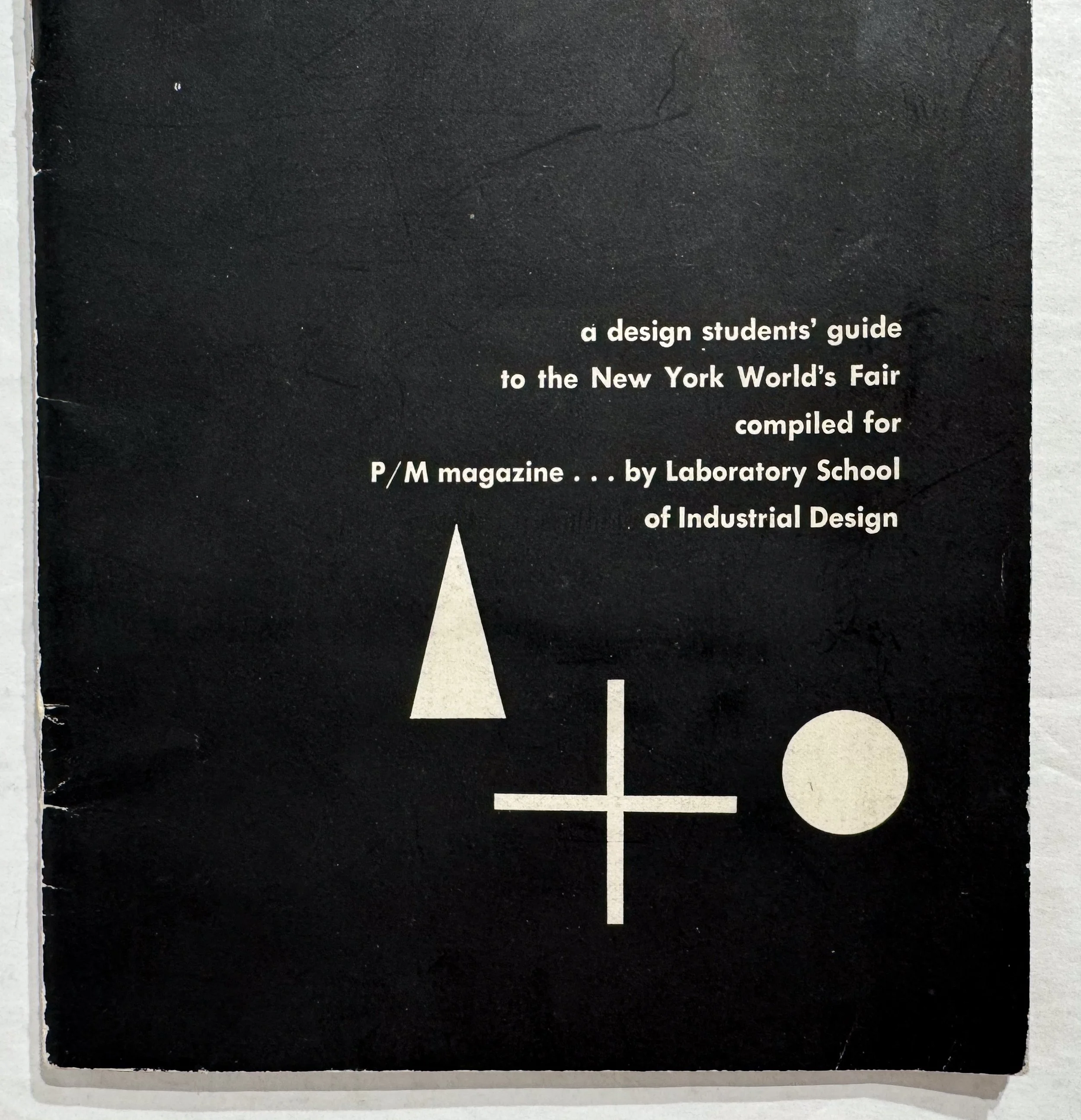 Image 2 of 13
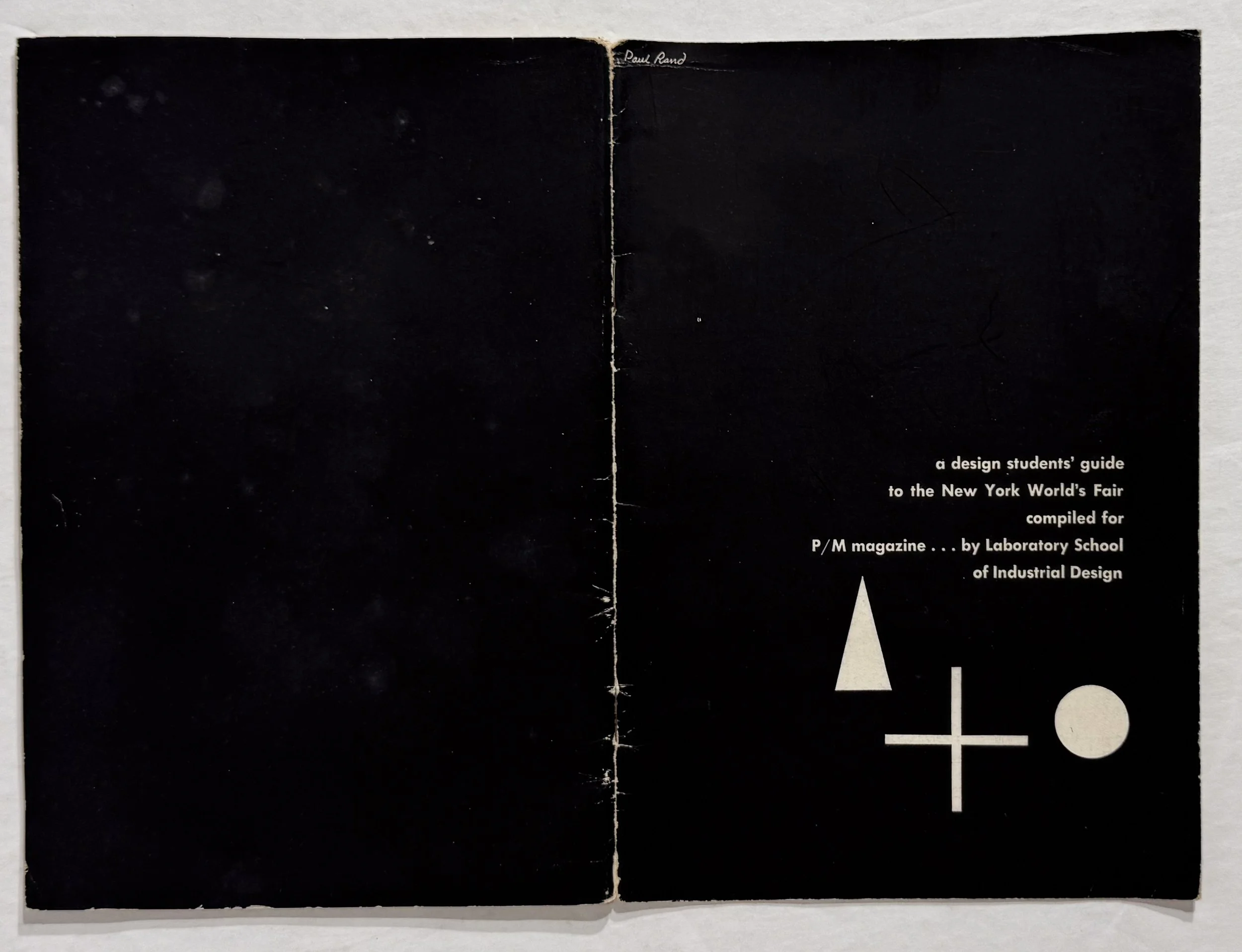 Image 3 of 13
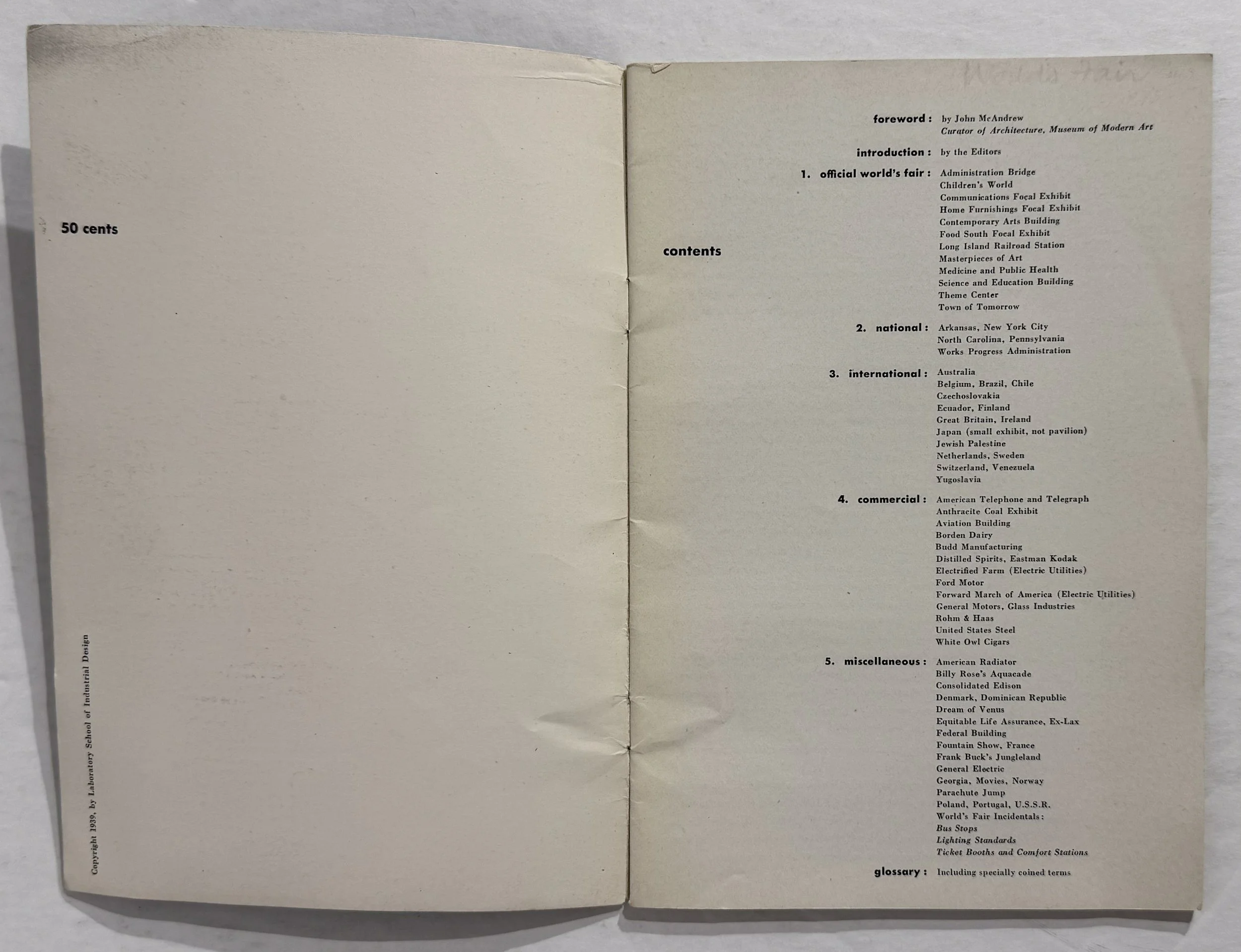 Image 4 of 13
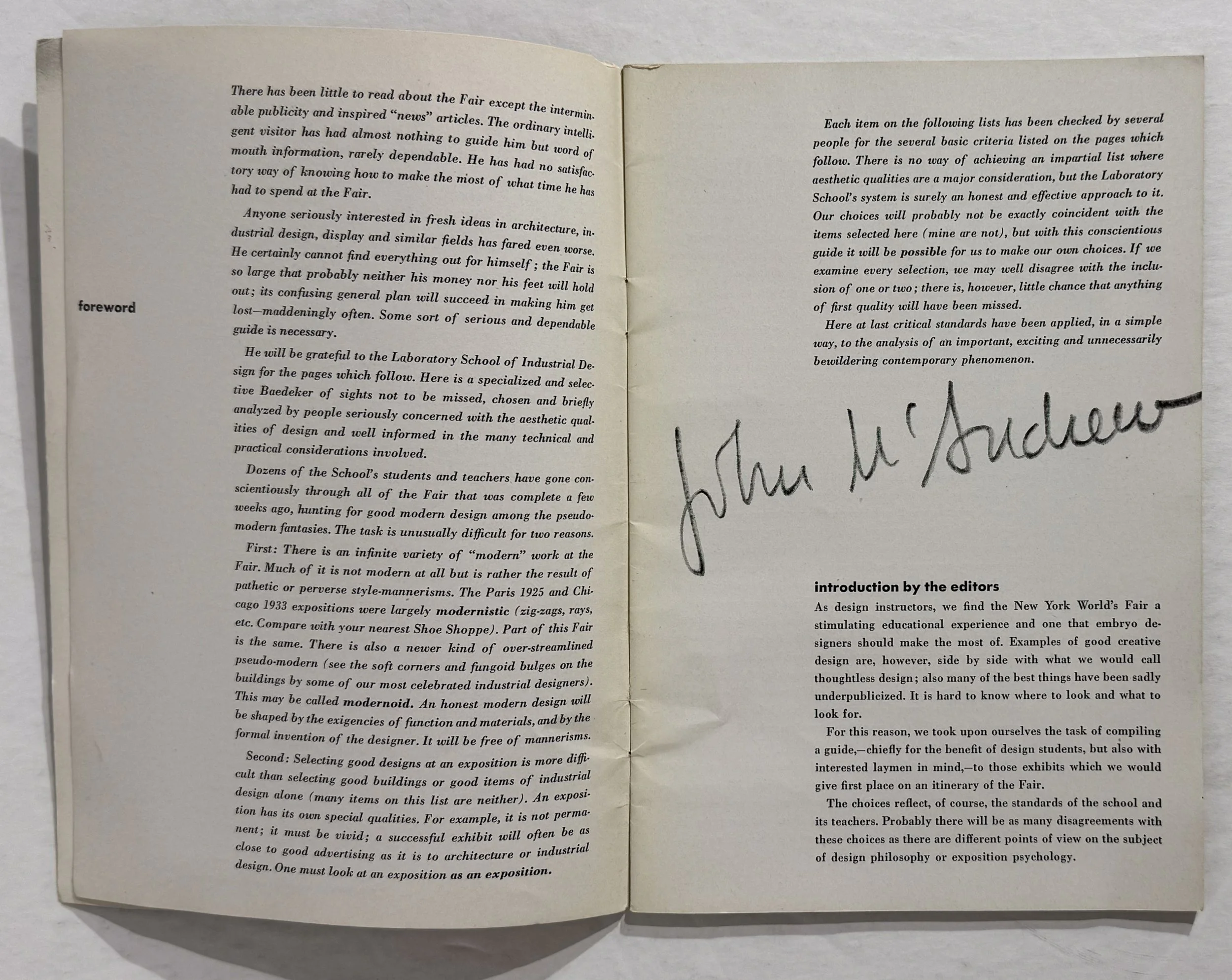 Image 5 of 13
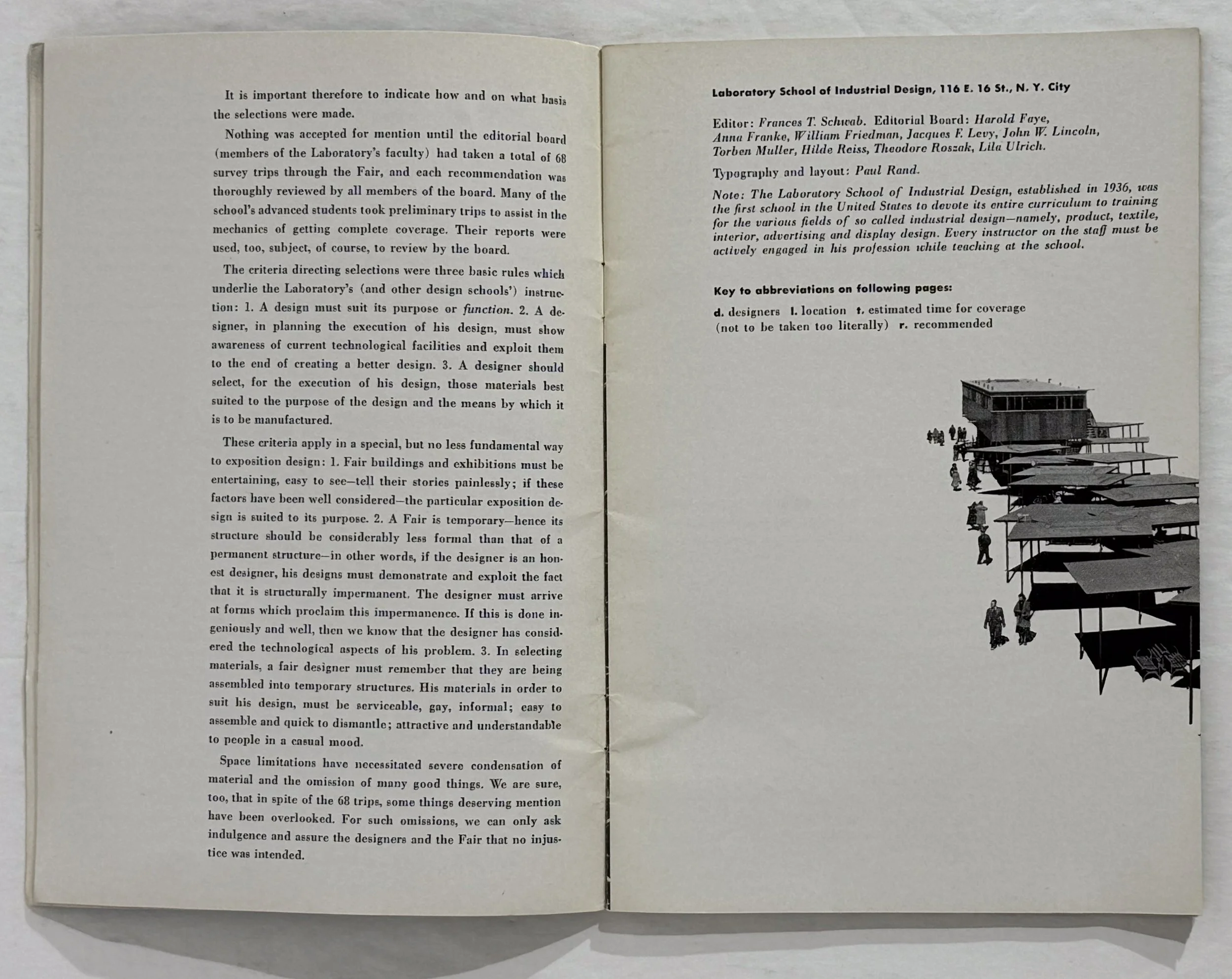 Image 6 of 13
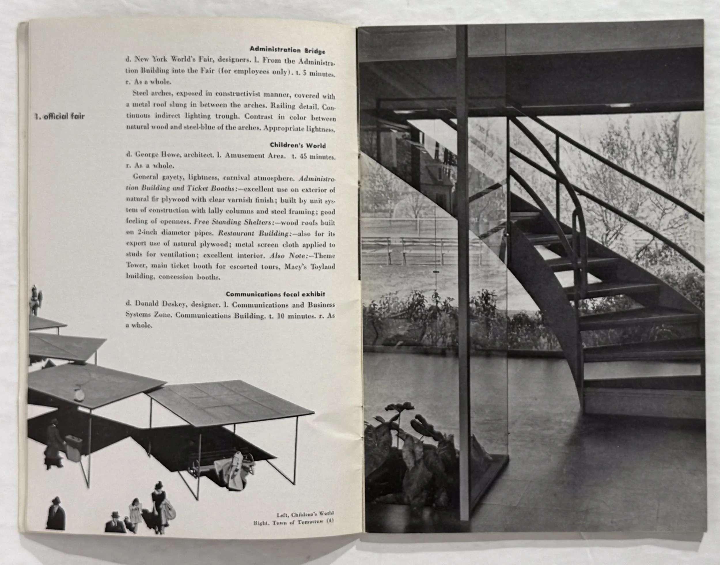 Image 7 of 13
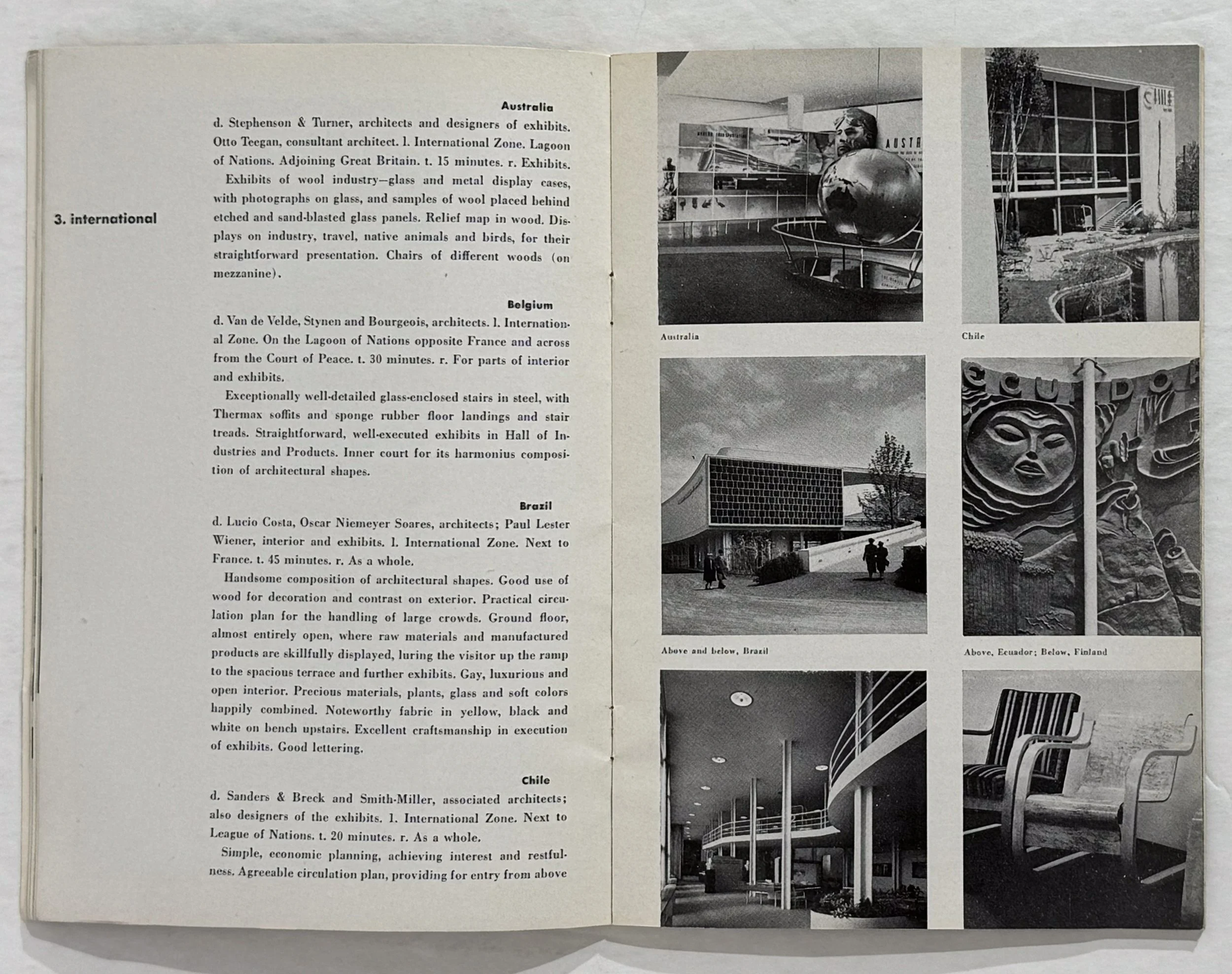 Image 8 of 13
 Image 9 of 13
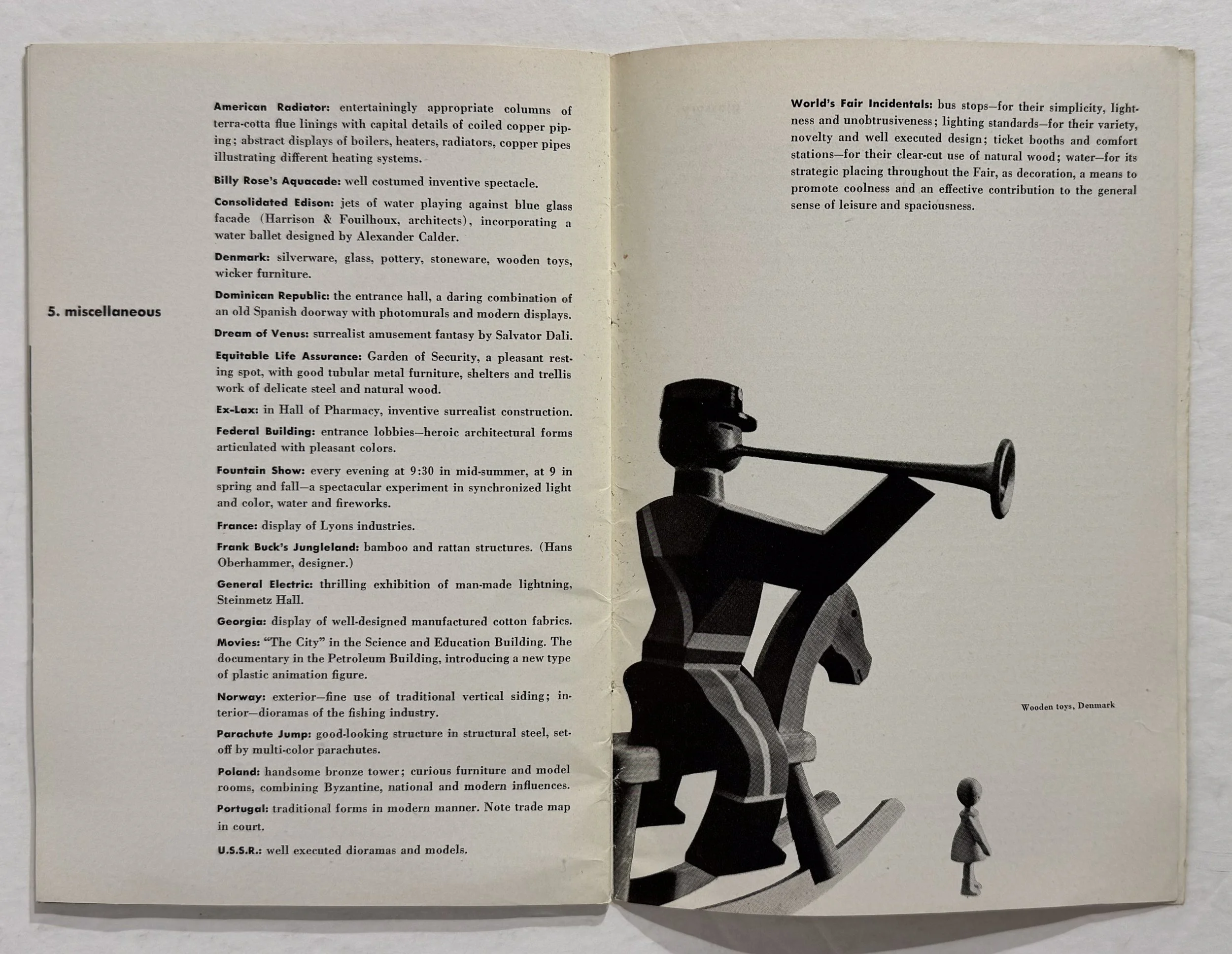 Image 10 of 13
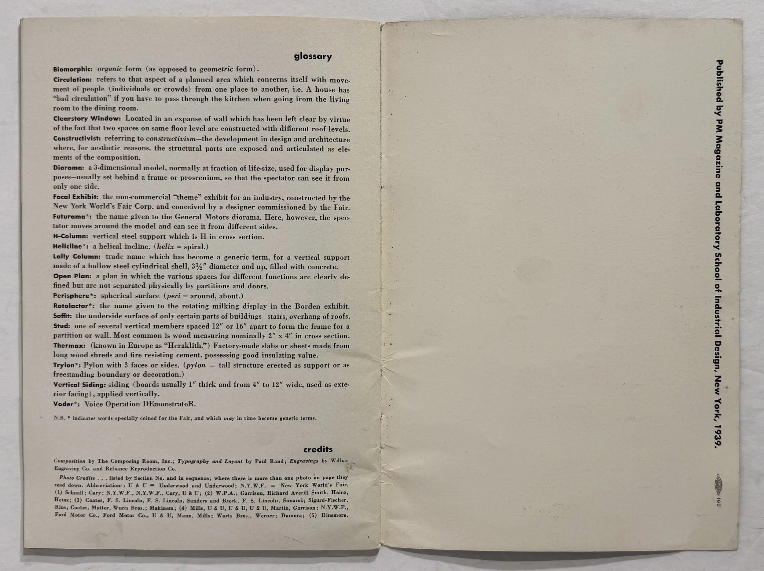 Image 11 of 13
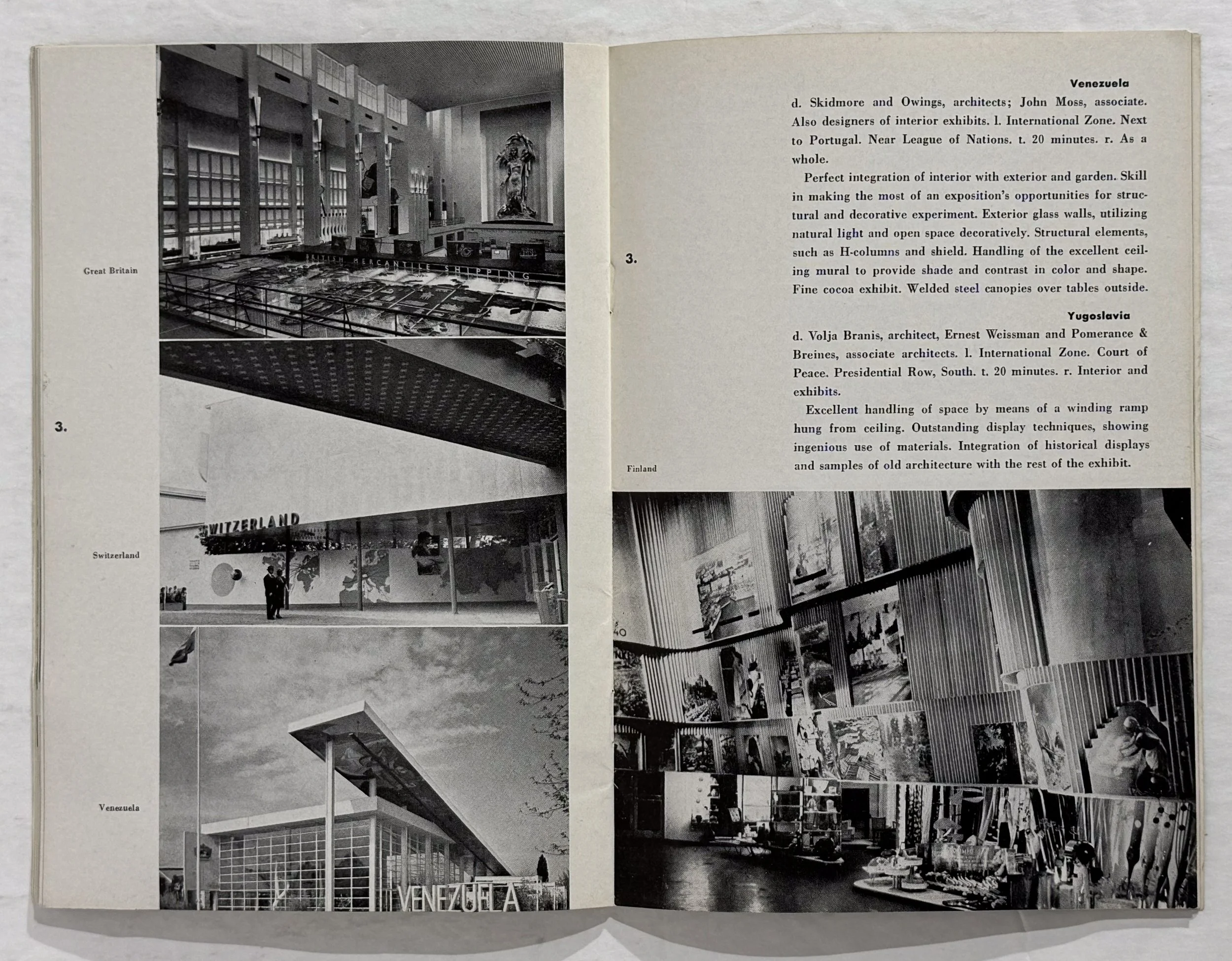 Image 12 of 13
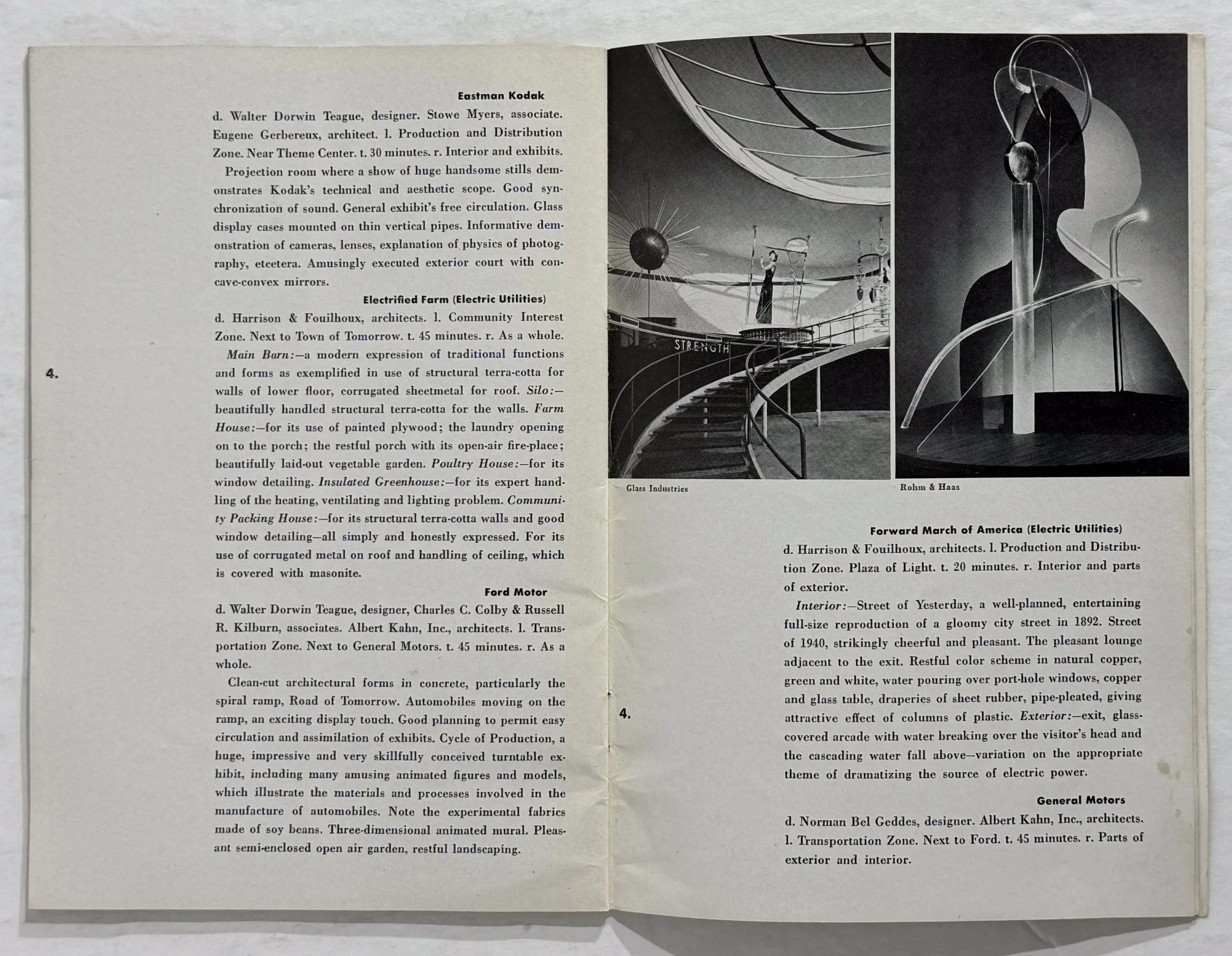 Image 13 of 13